
Tone
Elements of Design
Tone is simply the lightness or darkness of an object. Sometimes referred to as value, tone is one of the most powerful design elements.
In any painting, photograph or design, the area of highest contrast between light and dark will always demand maximum attention. The eye is naturally drawn to the area of highest tonal contrast.
There are squares of extreme dark and light throughout this design, but when they are placed together, it is the contrast that demands attention

In this design the eye is immediatly drawn to the area of maximum tonal contrast
Color and tone are unique and separate elements. All colors have a tone (degree of lightness of darkness) but tone can exist without color.
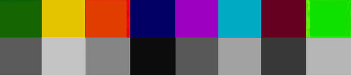
The gray scale along the bottom shows the tone of the corresponding color above.
In Rembrandt’s painting of “A Woman Bathing” he cleverly brings your eye in from the left and leads it up the figure to the area of maximum tonal contrast at the shoulder. From here the eye moves between the head, skin and folds of fabric. The band of dark tone surrounding the figure keeps the eye from drifting out of the picture.
Rembrandt has used a very tight color harmony and limited palette, relying on tonal contrast for impact. If we take all tonal contrast out of this picture by progressively darkening the lighter tones and lightening the darker tones, we are left with just the changes in color, completely removing the paintings impact
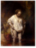
Rembrandt van Rijn, A Woman Bathing, 1654 – National Gallery London
(Click side arrows to animate)
Key and Dynamic Tonal Range
The dynamic range of tones used in an image has a strong effect on the atmosphere generated by the image.
The tonal range adopted is referred to as the key. A high key image uses a range of lighter tones not extending to extreme darks.
A low key image uses a range of darker tones not extending to extreme lights. A high key image employs larger areas of light tone, where a low key image will have a greater area of darker tones.

A high key and a low key treatment of the same image produce a completely different atmosphere
Generally, a high key image will feel happier, more inviting and more optimistic. A low key image will appear more brooding, heavy and depressing.
In the examples above, you would be more likely to trust the repairer in the first image, but would have doubts about the job done by the repairer in the second image.
Relative Tonal Relationships
Tone, like color, is influenced by the field in which it is placed. What might appear as a dark tone in one situation, can take on the appearance of a lighter tone when the surrounding tones are made darker. This point is illustrated in the following diagram, where the two dots are an identical shade of grey, but, because of the different tonal backgrounds, one appears much darker.

Relative tonal relationships
Author: John Lovett