
Painting Water
I don’t know what it is about painting water but for some reason its calm, horizontal suggestion in a painting always seems to draw a viewer in. These tips, techniques and ideas for painting water will help take away some of the mystery.
Maybe it’s the association of water with pleasure and relaxation? Perhaps it is the comfortable feeling brought about by the transition of subject to reflections in still water. Or is it just the strong stabilizing horizontal lines that make us feel safe and content?
Whatever it is There is something about painting water that makes you want to stop and stare. This group of paintings, while varying in subject matter, all have that hypnotic, pacifying effect brought about by the understated inclusion of water.
Sheltered Pool
Contrasting the dominant vertical lines of the saplings with the horizontal waters edge gives this painting a feeling of solid stability.
This feeling is amplified by the almost square format. The dominant cool blues and greys contrast with the warm reds and browns of the focal point, coinciding with the intersection of the main vertical and horizontal lines.
Painting Water a vibrant blue like this was made possible by building up washes of pure Phthalo Blue. These washes were taken up into the background to tie the strong blue into the rest of the painting.

Riverside
The low horizon line and dominant horizontal direction give this painting a calm, stable appearance.
This time warm greys and purples contrast with cool greens in the foreground and focal point.
A pale, uneven wash of Permanent Rose was first put through the sky and water, then the feeling of light was created by building up soft, graduated grey side washes, leaving a diagonal band of light to lead the eye down to the focal point.
Painting water with a dominant horizontal direction like this adds to the placid peacefulness of the subject.

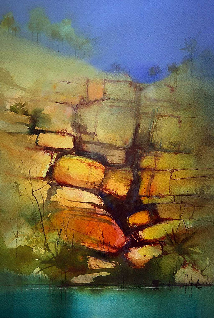
Sandstone Reflections
The warm reds and yellows of this sandstone cliff make a great contrast to the cool green water and the flat Ultramarine Sky.
Painting the water was started with washes of Phthalo Blue and Aureolin, then, once it was dry, soft dark reflections were dragged down.
A pale wash of the Phthalo Blue was taken up either side of the rocks to make the focal point stand out.
The flat, chalky sky is a mixture of Ultramarine Blue and white gouache.
Still Water
The sleepy waters edge of Dunedin, New Zealand is an interesting contrast of horizontal jetties, boats and water, contrasting with the vertical lines of masts and pine trees.
This painting was first built up with layers of watercolor then areas were worked over and lost with a series of thin gesso glazes.

Wicklow Harbour
This weather beaten collection of fishing boats in Wicklow, Ireland make a fantastic pattern of intricate colored shapes.
The confusion of masts, rigging and ropes add to the chaotic atmosphere. Keeping the sky and water simple and understated provides a contrasting area of calm for the eye seek refuge.
Had the sky been filled with clouds and the water, busy with reflections, the chaos of the boats would have been diminished and the painting would have become difficult to look at.
Paint was applied under and around the hulls on the water line then dragged down vertically with a clean damp brush to soften the edges.

When painting water, don’t simply copy what appears in front of you. Consider how the water can be used to enhance, stabilise, provide relief or lead the eye into your subject.
Sometimes the busy confusion of rippled reflections can serve as the main subject, but when the water plays a supporting role, try not to have it become a distraction and draw attention away from your focal point.
Water can add a calming, stable element to your paintings, but be sure to keep it under control.
Painting Water – Points to Remember
-
Reflections will have lighter darks and darker lights than the object reflected.
-
The intensity of reflections diminishes as distance from the object increases.
-
Colors in reflections will be less saturated than those in the object being reflected.
-
Use horizontal lines to add stability when painting water. Keep them parallel with the bottom edge of you painting.
-
Marks dragged down through water to suggest reflections work best if their edges are softened with a clean damp brush.
-
Simple reflections should be dragged vertically down, not leaning to one side or the other.
-
Tie the color of the water to the rest of the painting by washing that color into other parts of the work.
Author: John Lovett