There is often a temptation to be blindly led by the subject we are painting when it comes to decisions regarding color.
A much more effective approach is to extract only what we need from the subject then carefully consider how best to tie these selected colors to the rest of the painting.
Two useful tools to aid our color decisions are the use of complementaries and balancing saturated color with compound colors.

This color wheel is made up from mixtures of Indian Yellow, Perm. Alizarin Crimson, French Ultramarine Blue and Phthalo Blue (The core watercolors I use.)
The complementaries are colors directly opposite one another on the color wheel.
Indicated here are Yellow/Violet, Red/ Green and Blue/Orange.
Allowing one color to dominate and contrasting this with a small amount of the complementary around the focal point gives a painting impact but maintains a balanced color arrangement.
Saturated Colors
Saturated colors contain either one or two primary colors and no black or white. They are the purest colors of each hue.
For our purpose we use a 12 part color wheel containing 3 primaries (R,Y,B), 3 secondaries (O, G, V) and 6 tertiaries that sit between the primaries and secondaries
Compound Colors
Compound colors are colors containing all three primaries. They are all the earth colors - browns, khakis, greys etc.
Taking things a step further, we can bring saturation into the equation.

The outer ring of this color wheel is the same as the previous color wheel showing complementaries. It is made up of colors of the highest saturation possible from our core pigments.
The inner color wheel is of reduced saturation. This was made by mixing in a tiny amount of each colors complement. So, for example, the Indian Yellow has a tiny amount of Violet (Fr Ultra. and Alizarin) added to reduce its saturation, and so on around the color wheel.
These colors of reduced saturation are called compound colors and contain all three primaries.
Working with these colors of reduced saturation produces a more subdued result with greater color harmony. Adding areas of saturated color can really bring these more subdued arrangements to life.

Here we can see the range of compound colors available by progressively adding more of a colors complement.
In this case, increasing amounts of Yellow (Quinacridone Gold) was added to violet until 100% yellow was reached.
Cross mixing complementaries in this way can be done with any pair of complementaries around the color wheel. The result is an interesting range of compound colors.

The bulk of this painting is made up of compound colors - dirty reds, oranges and yellows all subdued by their compliments. Impact is given to the focal area by the use of a contrasting, saturated, complementary blue green awning and some primary reds and blues in the figures.
To create a diagonal movement through the painting I added more saturated color to the posters on the lower left and windows in the upper right.

This painting is built upon a gradation of compound colors from pale, warm, subdued oranges in the background to cool gray/blues in the foreground. The color harmony is very tight in these areas and there is very little tonal contrast.
By including strong darks and lights and saturated blues in the focal area, attention is drawn to the fishing boats. A little more saturated color around the buildings to the right help balance the composition.

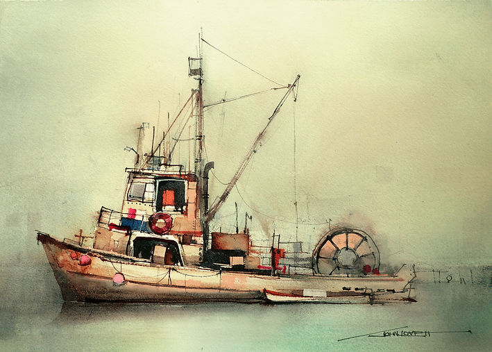
To create the weathered patina of this old fishing trawler, a palette of compound colors was used in combination with some Burnt Sienna Pigment ink (Also a compound color) Drawing attention to the focal area of the cabin was achieved by tonal contrast (strong darks next to white paper), rather than saturated colors.
The slight increase in color intensity in the cabin area is still a long way from saturated reds, blues or yellows. These slightly more saturated colors are enough to help hold attention while still maintaining the rusty, weathered nature of the fishing boat.

Unlike the fishing boat, this painting uses contrasting saturated colors for impact.
The saturated blue/green background contrasts with the red orange of the tiled roof.
A variety of compound browns make up the textured detail of the building, while a few flecks of pure, saturated Ultramarine Blue Gouache put life into the shadows of the focal point.
The dry rolling hills of this landscape suit a palette of compound yellows, greens and grays.
As the painting progressed so did the color intensity. The intensity of the yellow grass was increased towards the focal point and the trees were made slightly greener and darker in the focal point.
The final step here was to splash on some pure Permanent Rose to intensify the focal area.
The transparency of the Permanent Rose keeps it from becoming a saturated red and drawing too much attention.
There is no need to become too theoretical about the use of saturated and complementary colors. A simple approach to using compound or unsaturated colors is to mix all colors by adding whatever color you are mixing towards to a puddle of neutral gray on your palette. Saturation can be increased as the painting evolves, giving much more control over the outcome.
Author: John Lovett

